Lookbooks Autumn/Winter 2012
Fallen Footwear
*click on the images to enlarge
|
|
|
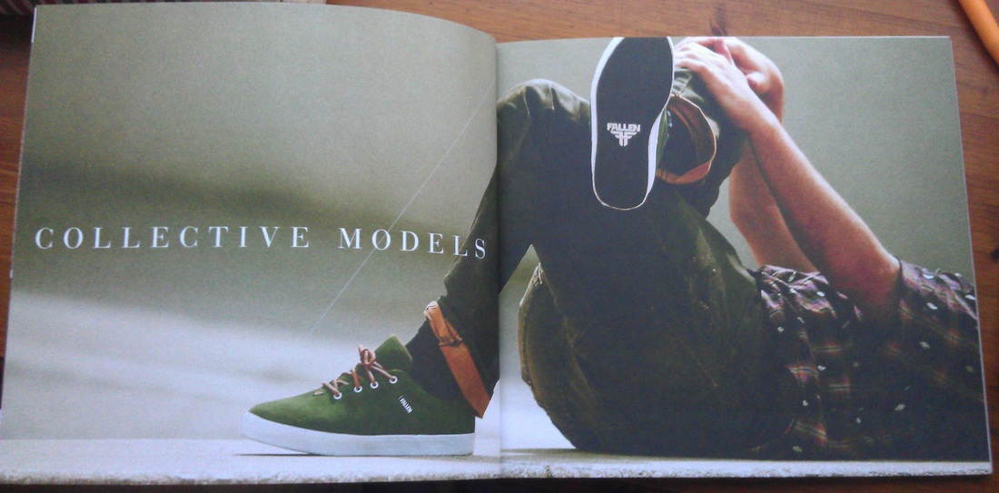
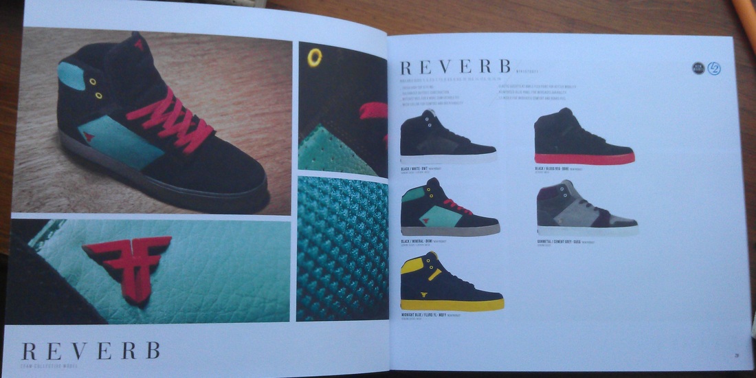
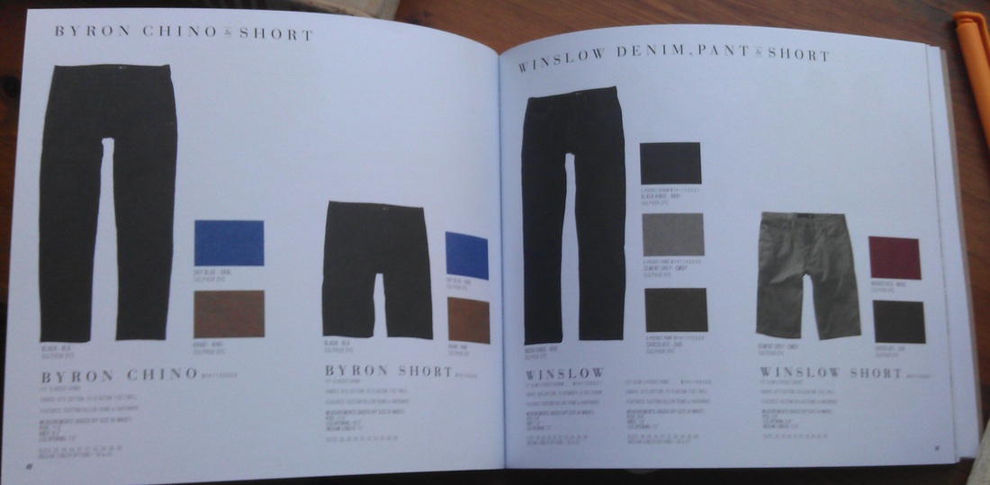
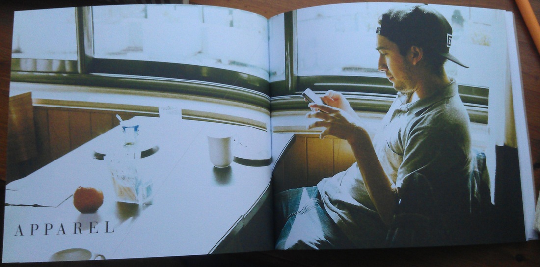
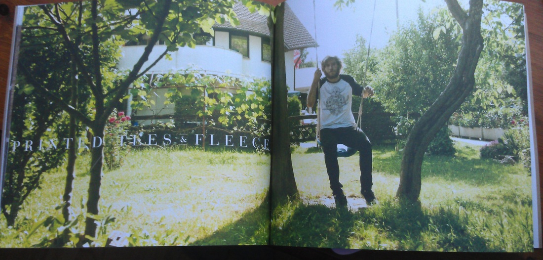
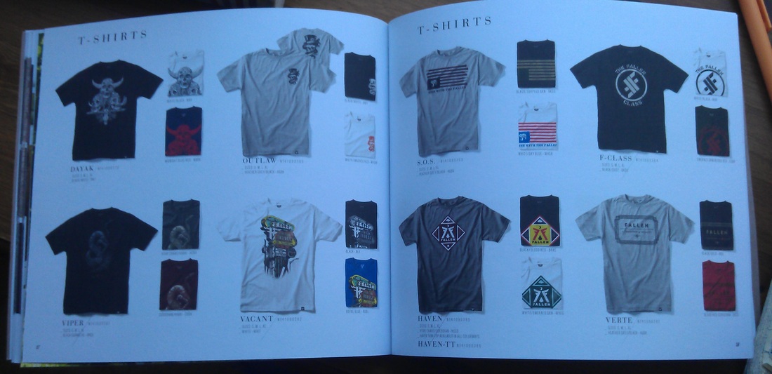
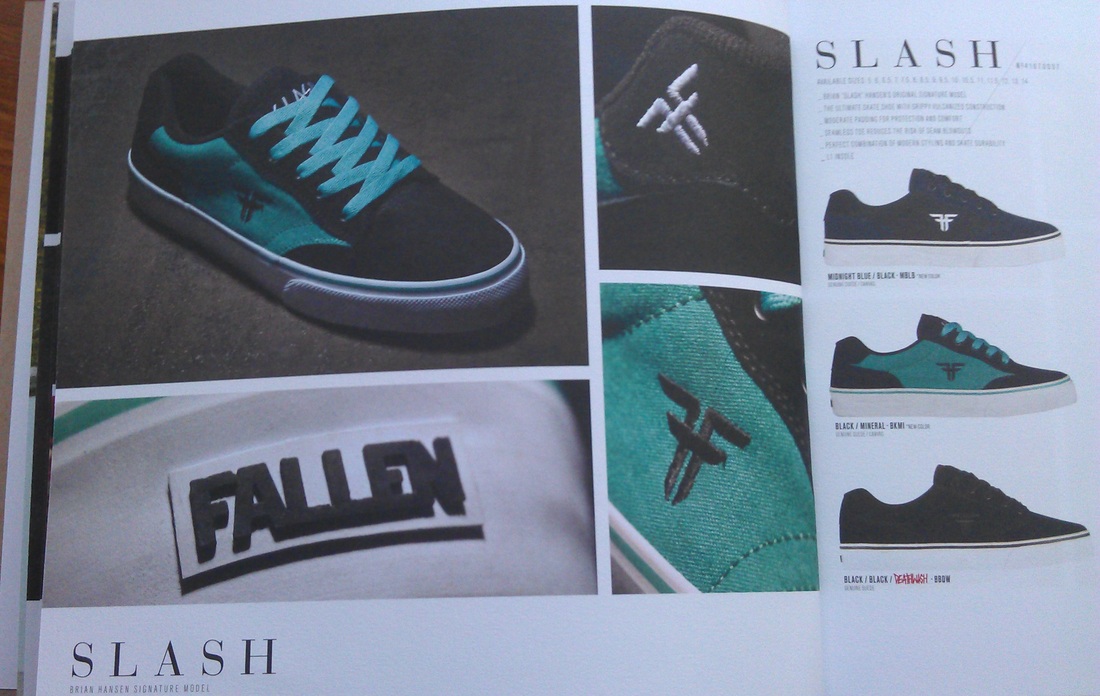
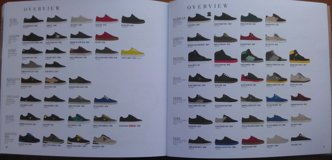
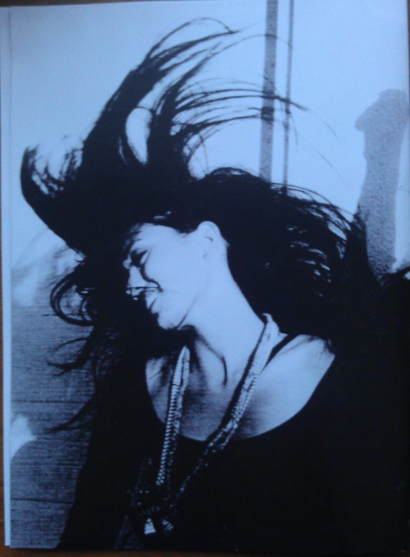
Fallen have gone all out for their 10th anniversary A/W’12 lookbook. Made from quality paper book has amazing graphics and colours. It has a consistent and clear flow; each main section has a double spread image with the title written in a classic Fallen Typography. All the collections are shown clearly and thoroughly. On the right hand side you can see close ups to the products, where on the left hand side you can see them in full with all the info you need to know. With the clothing collections you can not only see the products, but also colour palette that allows you to choose the right selection for you. At the back there is an overview page with all the shoes from all the collections allowing you to compare and contrast your top picks. Very stylish and modern approach; my favourite by far.
|
|
|
|
|
|
|
More from Fallen Footwear at:
http://fallenfootwear.com/
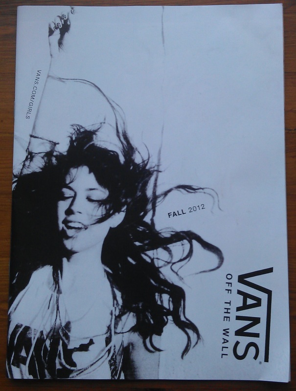
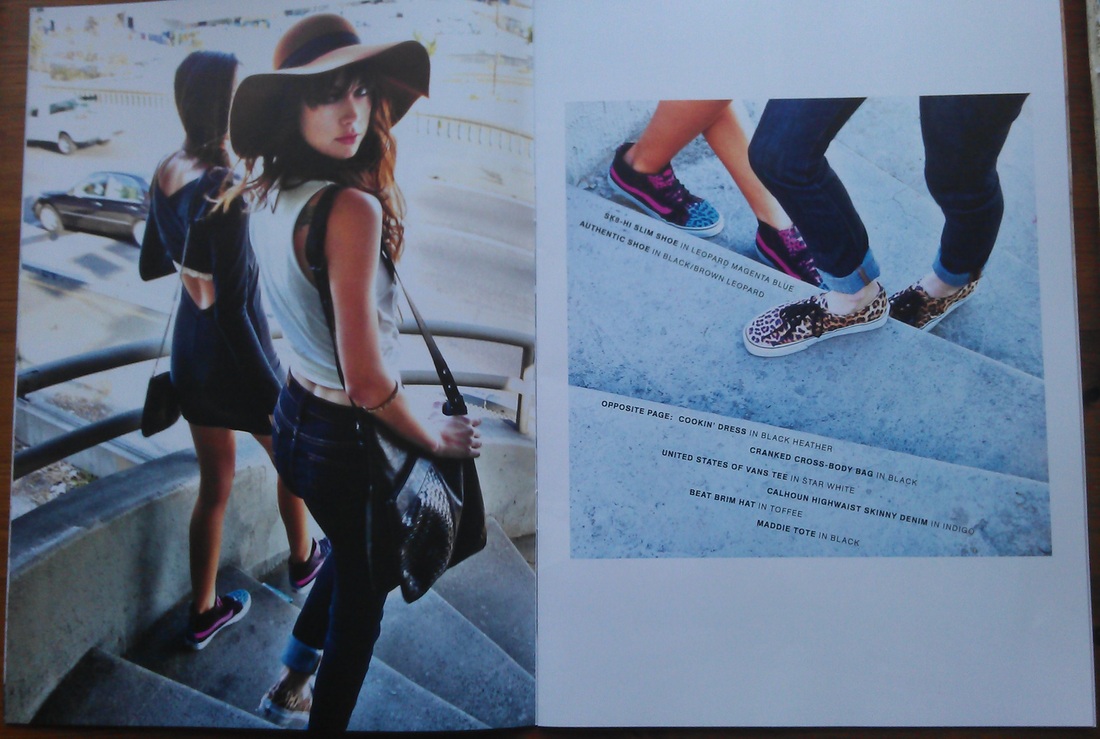
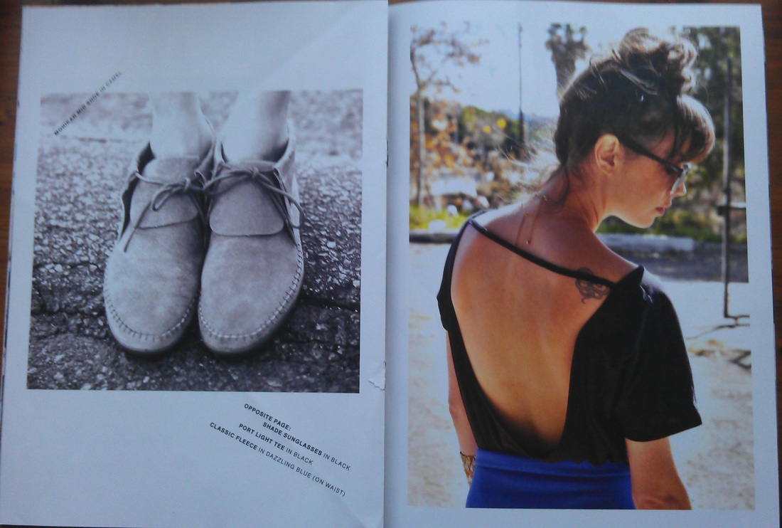
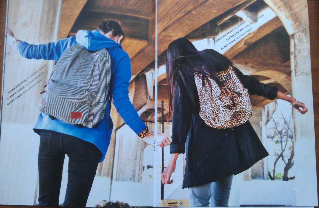
Vans Girls
|
|
|
|
|
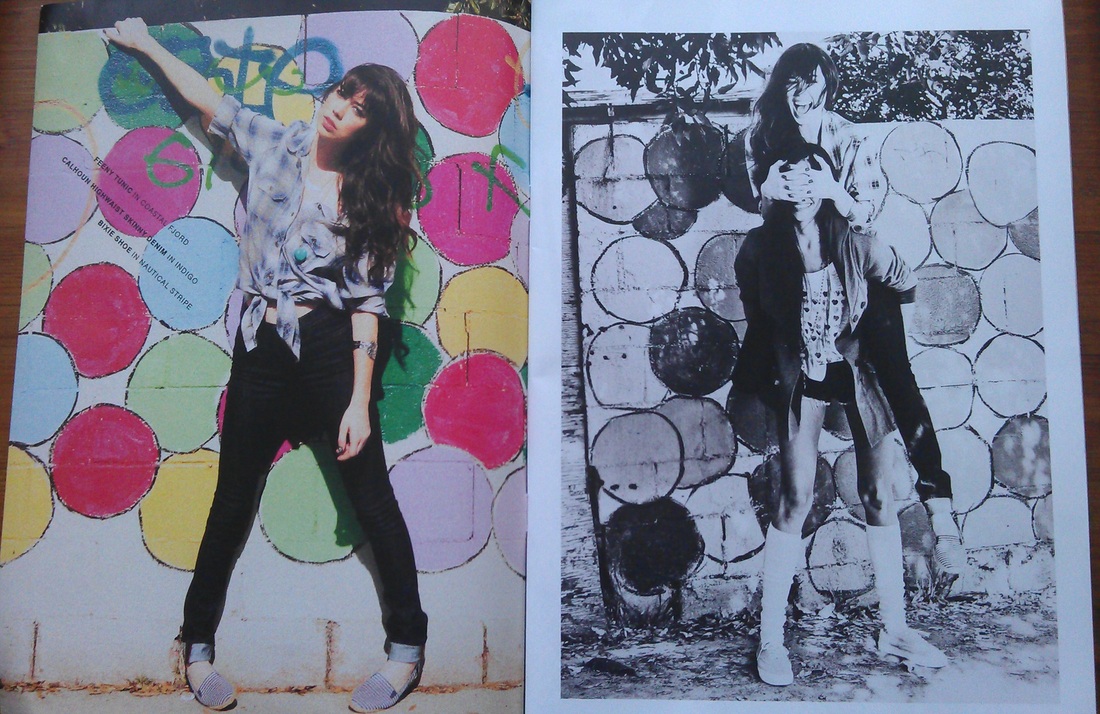
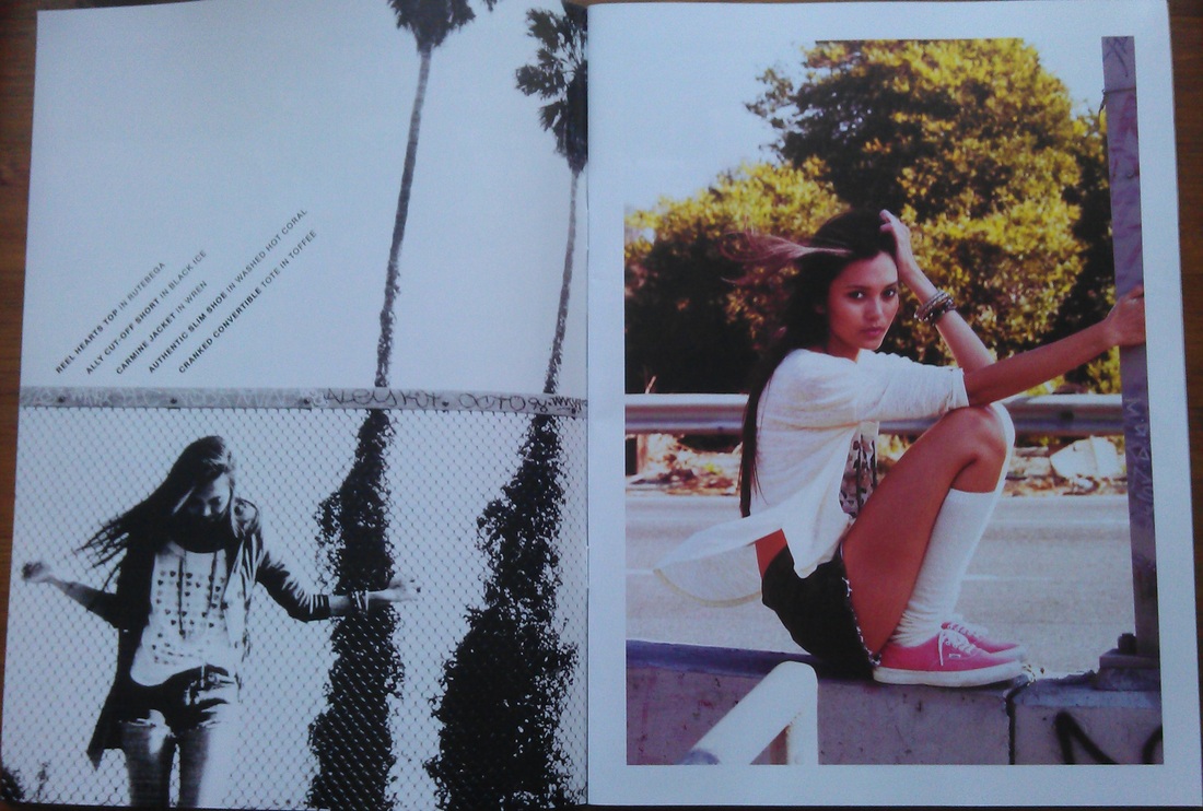
Vans girls showcases their products in a funky and fresh way. Especially with the girls collection they chose black and white and colour images for their lookbook. With this mix we can feel what the collection stands for and understand what look they are going for, whether it’s rainy day blues or sunny day shopping with friends. Vans girls products usually lean towards fashion rather than function, but then girls just want to look pretty I guess. |
|
|
More brand infot at:
http://www.vans.com/microsites/womens/
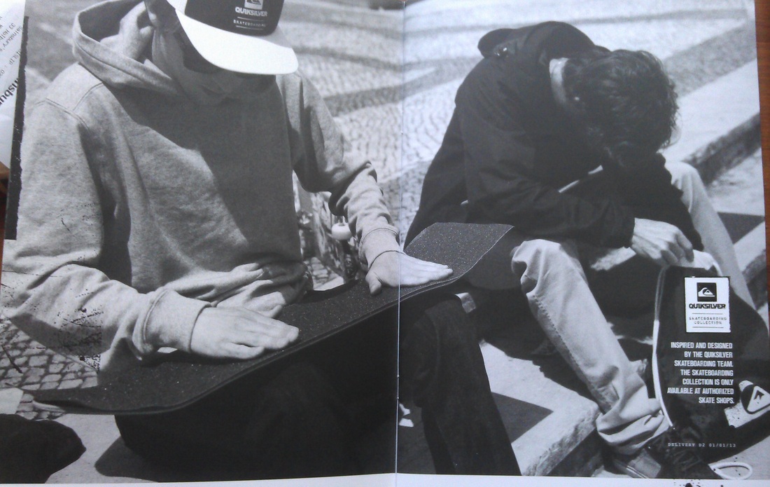
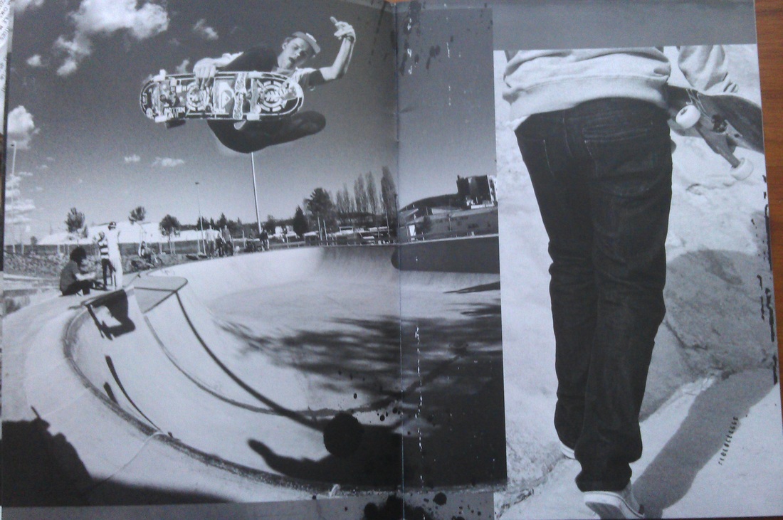
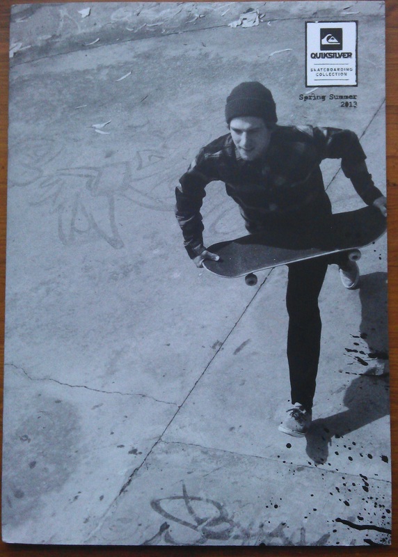
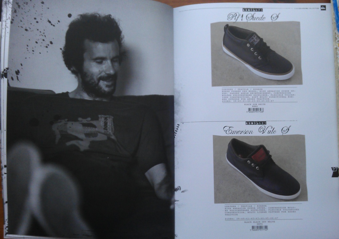
Quicksilver
|
|
|
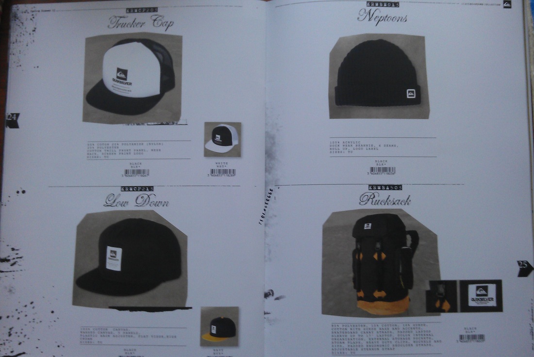
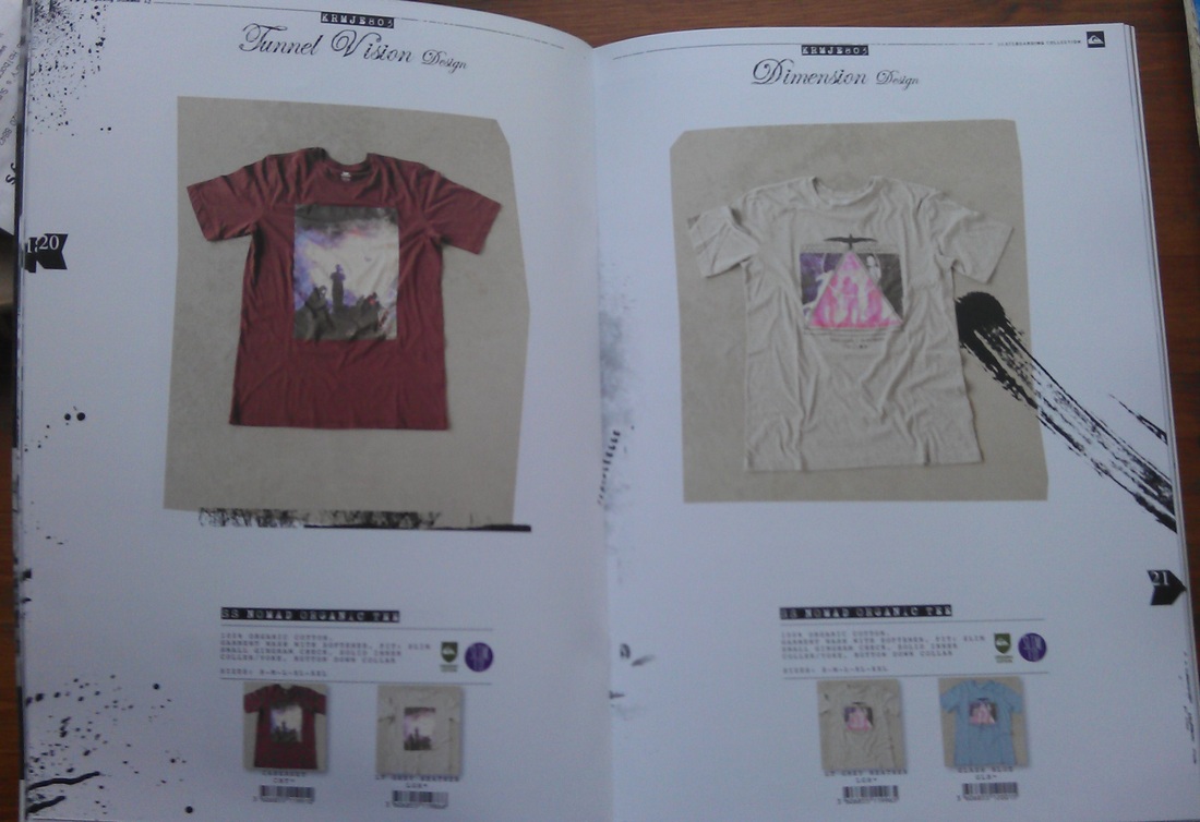
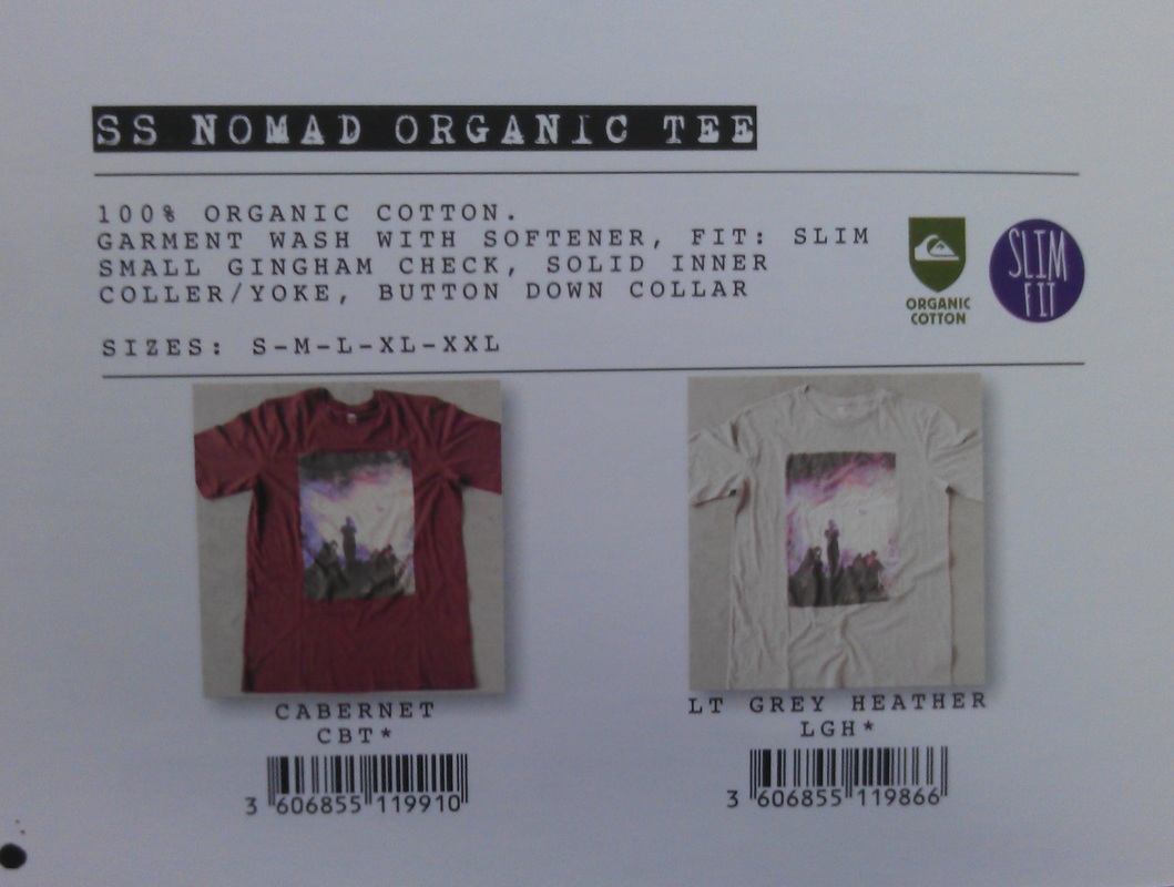
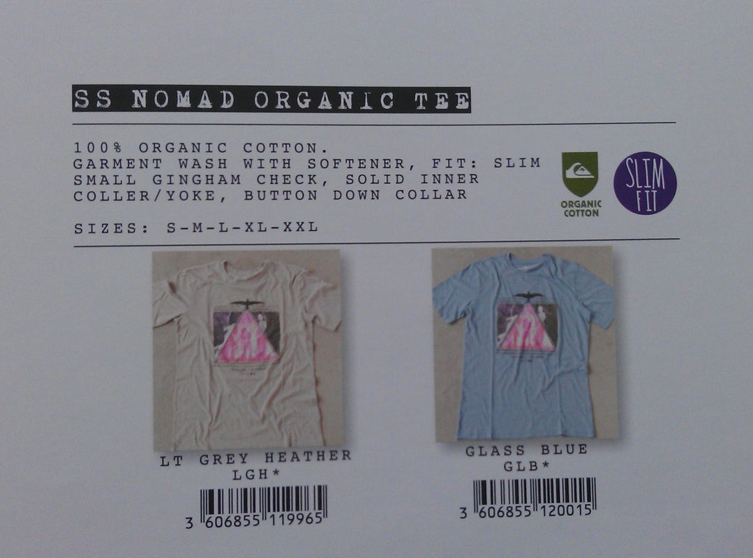
Quicksilver went for a black and white look for their A/W’12 lookbook this year. With full spread images as their main collection page and smaller product icons similar to the Fallen Footwear lookbook it has a nice flow to it. Products description is specific and to the point, in the smaller icons you can see the exact materials, sizes, colours etc which can help you pick the right product for you. |
|
|
|
|
|
More brand info at:
http://www.quiksilver.co.uk/
Unabomber Skateboards
|
|
|
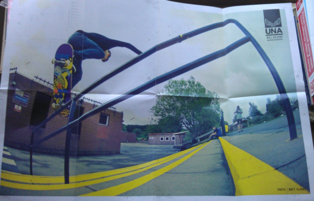
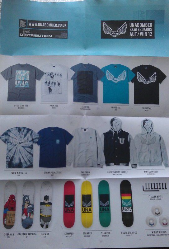
Unabomber went for a simplistic design, with a leaflet that folds out into an A3 size poster on one side and the collection on the other. As a new and fresh brand with a laid back attitude this lookbook definitely reflects their attitude and approach for the skateboarding market. |
More brand info at:
http://www.unabomber.co.uk/
Posted 14/09/2012
